
If your average ‘time on page’ metric is so low that you can limbo under it, don’t worry – we’ve got your back.
In this article, we’ll cover certain elements to bring you up to speed on this metric, as well as tell you what you might be doing wrong.
- Why is the average ‘time on page’ necessary?
- What’s the difference between average ‘time on page’ and average session duration?
- What ‘time on page’ benchmark should I be hitting?
- Where can I track the metric in Google Analytics?
- What exactly am I doing wrong?
The ‘time on page’ metric is an excellent insight into whether you’re attracting the right audience to your site. It works out the amount of time your visitors spend on every single page of your website.
The exit page, unfortunately, doesn’t get recorded, but more about that later.
You may already be familiar with the term ‘bounce rate’, which is similar but also quite different from ‘time on page’. Bounce Rate is the percentage of users who land on your website then leave without taking another action, such as clicking or navigating to another page. If your content isn’t providing instant answers to search queries, you’ll be looking at a higher bounce rate.
To put the above into context, a user finds your landing page in the SERPS and clicks through to read your article. They spend 5 minutes reading your content then exit back to the search results. No matter how much time the user spent on the page in this scenario, this is recorded as a bounce and will contribute towards a high bounce rate; this is where ‘time on page’ differs. ‘Time on page’ measures the number of sessions on a particular page, and the time people spend on it before taking another action. This action could involve navigating to a new page on your website; this is where you can see if your content attracts the right audience.
However, it is essential to note that the sessions won’t be recorded if users don’t complete a second action after clicking onto your landing page.
Why is a high average ‘time on page’ necessary?
Having a high average ‘time on page’ means your content is captivating your readers. They have a reason to stay on the page! (Psst, you can learn all about making your content captivating here.)
This metric can help you determine if your page meets the expectations of the keywords you target for SEO. If your users are hopping off the page as quickly as they hopped on, your content may not be as relevant as you first thought.
Another excellent tip for determining the pages that need help is keeping an eye on the exit rate. Exit rate is the percentage of users who left your site from a particular page, and a high exit rate is something you want to avoid.
What’s the difference between average ‘time on page’ and average session duration?
‘Average time on page’ measures the amount of time a user spends on an individual page during their session. For example:
A user enters your site on a particular page from a search engine at 11:00 and navigates to Page 2 at 11:01. The website records the timestamps of landing on the Home Page and landing on Page 2. Google Analytics takes these timestamps and minuses the first timestamp from the second. Therefore the time spent on the Home Page is 1 minute (11:01 minus 11:00).
After reading Page 2, the user clicks a link to navigate to Page 3 at 11:06. Again, the website records the time landed on Page 3 and works out the difference from the timestamp landing on Page 2, meaning the time on page 2 is 5 minutes (11:06 minus 11:01).
Finally, after Page 3, the user decides to exit to a different website. This time, however, Google Analytics can’t see the timestamp on the following website. The exit page (the last page of their visit) is the only page where this metric does not get tracked.
To work out the average ‘time on page’, Google Analytics measures the total time spent on the page within your specified date range, then divides this with the total number of page views minus the number of page exits.
The ‘average session duration’ metric in Google Analytics reports measures the average time users spend on your website. Google Analytics measures the ‘average session duration’ metric from the first page a user lands on to the last action taken by that user on any page on your website before they exit.
Using the example above, we can work out the user’s session duration:
| Action | Time |
| User lands on homepage | 11:00 |
| User navigates to Page 2 | 11:01 |
| User navigates to Page 3 | 11:06 |
| User exits site | – |
| Total time on site | 6 minutes |
To calculate the average session duration within your specified date range, Google Analytics sums up all sessions’ total duration and divides it by the total number of sessions. E.g.:
- Total Session Duration: 1000 minutes
- Total Sessions: 100
- Avg Session Duration: 1000/100 = 10 minutes
Event tracking is a method available that you can use to record interaction with website elements. You can attach the method call to particular user interface elements that you want to track. When used this way, all user activity on these elements is calculated and displayed as ‘events’ in the Google Analytics reporting interface.
What ‘time on page’ benchmark should I be hitting?
The average time spent on pages across industries is 62 seconds. However, this differs for different sectors, different page types and different lengths of content. For example, the average increases slightly to 65 seconds for product pages and checkout pages.
See this graph by Content Square on the average time spent on page per industry.

Where can I track the average ‘time on page’ in Google Analytics?
You can find the average ‘time on page’ metric in your Google Analytics account by going to Behaviour > Site Content > All Pages. Here, you can find the average time spent on each page on your site.

The ‘time on page’ column displays the average amount of time visitors spend on each page of your site during Google Analytics sessions; this is only available after linking Search Ads 360 advertiser with a Google Analytics web property.
It’s essential to keep in mind that context is vital as with other web performance metrics. It’s a good practice to measure each metric alongside each other to give a more accurate picture of engagement!
So, what exactly could you be doing wrong?
Below are some common mistakes made by website owners across the world. Let’s take a look at the ones you may be making and how to fix them:

- Your pages aren’t readable enough.
- Your links open in the same tab.
- You’re not adding a contents table.
- You don’t include videos in your content.
- You aren’t varying your content.
- You’re not telling people what they want to know early enough.
- You’re not linking to related articles.
- Your design isn’t ‘clean’.
- You’re not adding interactive content.
- Your site isn’t mobile-friendly.
Your pages aren’t readable enough.
Readability on pages is one of the most important reasons why your readers may be leaving your page. It is the measure of how easy it is for the user to understand the text on a webpage based on the presentation, format and context.
Many factors affect this, and there are specific ways you can make your pages readable:
- Don’t babble on! Most users like to have the info they are looking for served on a silver platter. Make your content concise to give the reader what they want.
- Use familiar language. Your readers won’t want to spend time googling what certain words mean. Give thought to who your readers are and amend your content to suit them.
- A picture speaks a thousand words. Well, maybe not in this case. But they do provide the reader’s eyes with something pretty to break up the black and white text.
These are just a few ways to increase readability on your site, but we have a full article of tips that you can read here.
Your links open in the same tab.
If the links in your article don’t open in a new tab, you’re wasting precious ‘time on page’! Make sure to make your links open in a new tab by adding a target=’_blank’ attribute in the HTML.
By clicking a link that opens in the same tab, you’re directing your reader off the page, meaning your average will decrease.
Opening in a new tab is one of the easiest ways you can ensure your reader stays on the page, as if it opens in a new tab, they’re sure to return to the original page!
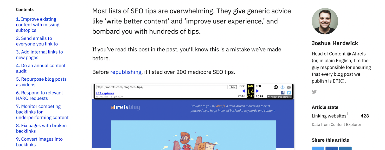
You’re not adding a contents table.
Adding a contents table at the beginning of your article is a great way to let your readers know what they’re in for. They can quickly scan the contents to get the information they need boosting engagement and ‘time on page’.
If your reader struggles to find the specific information they need immediately after landing on your page, it’s not far to go for another option!
Incorporating a table of contents to the top of your page is easier than ever with plugins that can automatically create them for you using headings in your article. So what’s stopping you?
Here’s an example from ahrefs.com. Their blog sections are clearly set out down the side for you to get to where you need to be in an instant.
You don’t include videos in your content.
Videos are fast becoming one of the most popular forms of content marketing and for good reason! Videos promote user engagement and are a great way to raise brand awareness. And if your videos are shareable enough for social media, you may even become a viral hit!
Creating great video content is easier than ever before, with most camera phones being high quality, so get shooting the next viral video now!
Adding videos to your pages can boost the average amount of time a user stays on the page to interact and engage with them, so having a great video content marketing strategy is a great option to consider.
You’re not varying your content.
Relating to the point above, if your content is solely text on the page, this is a great way to drive your readers away! All they’ll see is blah blah blah.
People remember 80% of what they see and only 20% of what they read. So try adding in a little colour and variation to your content to engage with your readers! The content variations could be in the form of:
- Video (as mentioned above)
- Images. Including relevant and thought-provoking images can make your content stand out as well as explaining more detailed information. They also break up big blocks of text, which allows your readers to stay engaged.
- Infographics. Our brains LOVE infographics. Our brains can digest way more information if given to us in a more visually appealing and illustrative way. And we’re naturally more likely to stick around and read something pretty!
- Charts. Including charts and graphs in your content gives your readers the information they need in an easy to read format that is so much easier to digest than stats on a page.
You’re not telling people what they want to know early enough.
People are pretty straight forward. You tell them what they want to know straight away, and they’ll stick around to see what else you have to say about it.
Giving your readers an idea of what the article will entail, or even the solution to their question, will entice the reader to read more about it on your page.
If your page discusses multiple ideas and goes off on many different tangents before you get to your readers answer, better believe they will leave your page!

You’re not linking to related articles.
Not only will linking to related articles improve your avg session duration, but it will also boost your avg ‘time on page’!
By linking to articles that your readers are interested in, they are more likely to spend time reading that page, increasing the time spent on the pages and the site in general.
Your design isn’t ‘clean.’
It only takes users 15 seconds to skim the page and decide if they want to stick around. Don’t you want to make a great first impression?
A clean page layout makes your content a lot more attractive to your readers. Ever landed on a ‘messy’ web page? Where there are ads and general clutter where you’re supposed to be reading? Instant turn off.
If you find that your content includes keywords that users are searching for, but your ‘time on page’ is shorter than you want it to be, it’s time to evaluate your user experience.
That’s why it’s essential to keep your pages easy on the eyes. It’ll help make your readers stick around a bit longer and see what you’ve got to say.
Also, having a clean and simple design is timeless. So you won’t have to update this as often (bonus!).
You can use specific heatmap tools to help you determine if your design needs to be updated. These fabulous tools show you the real-life activity of your users, like where they click the most, at what point they lose interest and even gives anonymous screen recordings of users’ journeys through your pages.
You’re not adding interactive content.
By adding interactive content to your page, you’re giving the reader something to stick around for, therefore increasing ‘time on page’.
- Polls
- Surveys
- Quizzes
- Videos
- Calculators
These are all elements that will pique interest and promote interaction. It is found that 66% of marketers report an increase in engagement levels after introducing interactive content. So go forth and add those polls!
Your website isn’t mobile-friendly

62% of internet users worldwide access the internet from their smartphone, so it’s pretty essential that your page be mobile-friendly if you want to keep those users on there! Mobile-friendly means your website responds correctly to mobile size, without the need of having to scroll left to right to see the elements on the screen. Take the Quuu website, for example:
Visitors leave a site when it is unusable, and over the last decade, we’ve become used to webpages looking a certain way. 30% of users will abandon shopping from a site just because it isn’t mobile optimised. That’s a whole lot of users.
Not sure if your site is mobile friendly? There’s a tool for that.
Quuu’s Final Thoughts
Well, we got there in the end! Hopefully, you can leave here with a better understanding of the average ‘time on page’ metric, why yours may be low, and what you can do about it.
We’ve even made this infographic for you to refer back to!