Your brand is what makes your business unique. It’s everything from your niche and values to your visual identity.
But so many companies put too much emphasis on design and not enough on the customer experience. No one wants to buy a product or service they don’t understand. And a great name and logo won’t make you successful.
The most successful brands put thought into every stage of the customer journey. You want to create a memorable experience that makes people want to come back again and again.
So, here are 3 branding case studies that are doing just that:
- Good Pair Days – rebranding and rewards done right
- Riverford Organic Farmers – honest marketing and a simple customer journey
- Itch – two personalized services for the price of one
Good Pair Days – rebranding and rewards done right
Good Pair Days is a D2C wine subscription that started life as “The Wine Gallery”. But after a new brand name and huge redesign, they’re now one of my favorite brand identity case studies.
The brand strategy starts with a quick quiz. But don’t worry, newbies. None of it’s related to wine. You’re asked things like:
- The kind of chocolate you prefer
- How much butter you like on your toast
- A few fruits you couldn’t live without
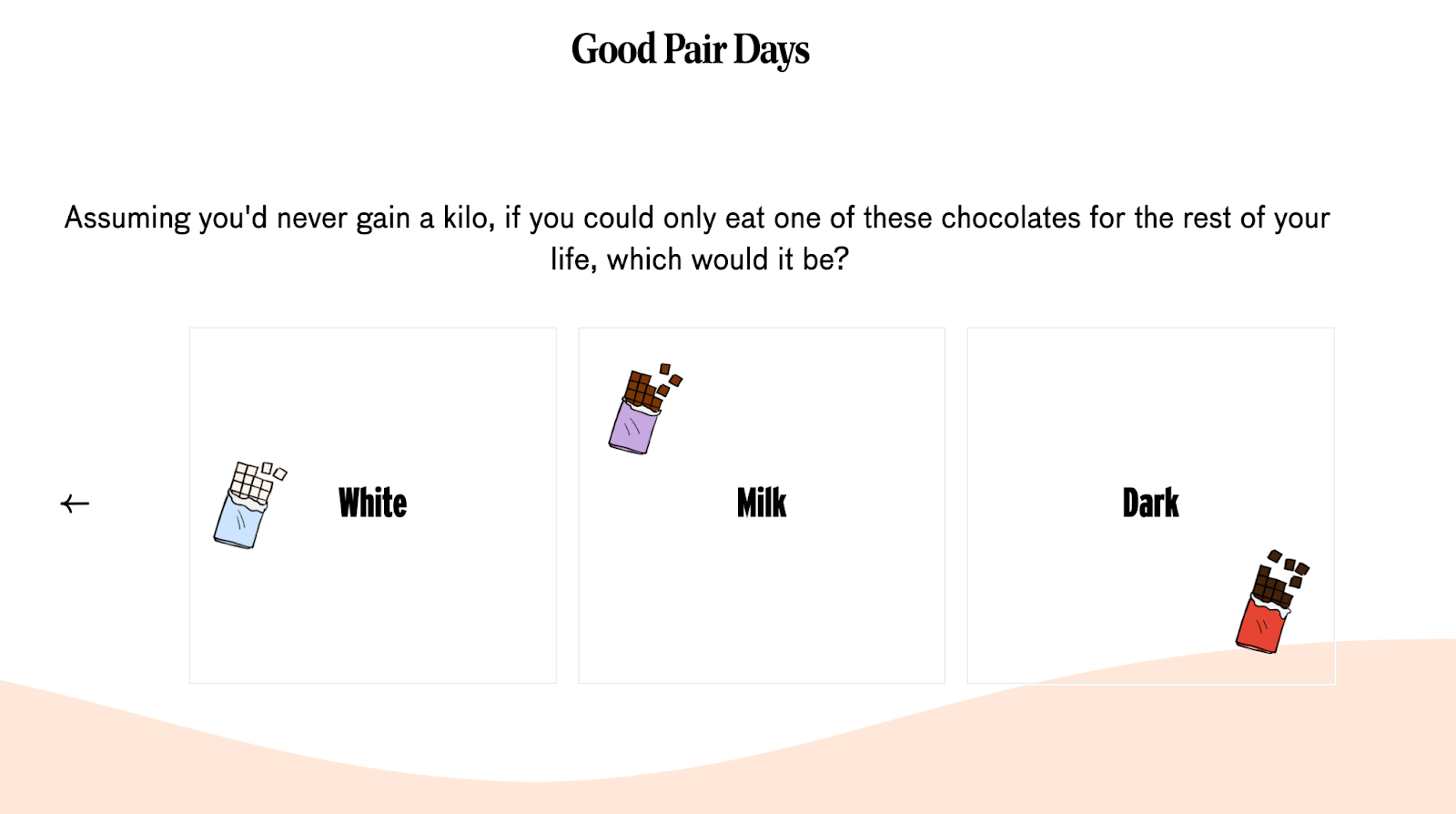
The quiz makes the service feel so accessible from the get-go. And it shows they know their target customer. One of the first things they also ask is your experience with wine. Then they adjust their level of explanation depending on your answer.
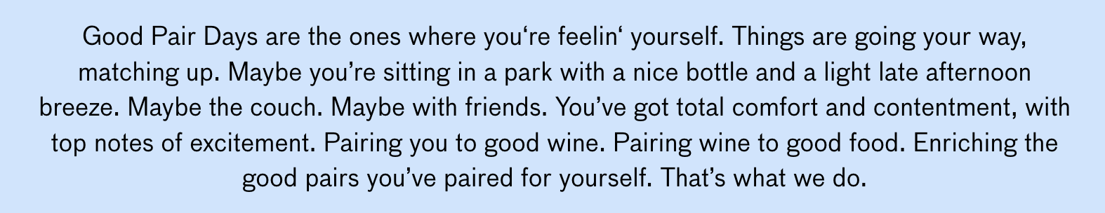
This fun brand voice is everywhere on the site. They use conversational copy wherever they can. And it’s casual, down-to-earth, and relatable. Which is so important in a typically stuffy, high-class industry.
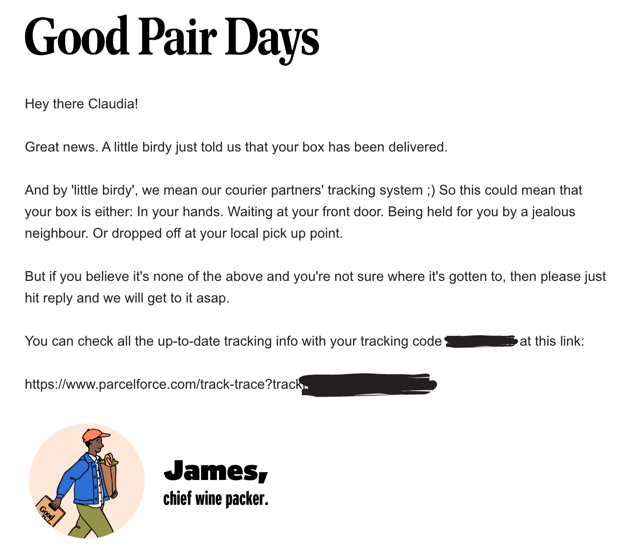
Plus, the amount of communication is just right. They let you know when your next box is due and what’ll be in it. (This gives you the opportunity to make edits and change the price before it comes.) Plus, all the usual delivery notifications.
But not just a generic tracking email from the courier. It’s all so personalized:
As a subscription business, they need to keep current customers happy. And the rewards system and gamification makes you keen to engage. You earn points for simple tasks like rating recent bottles or downloading the app.
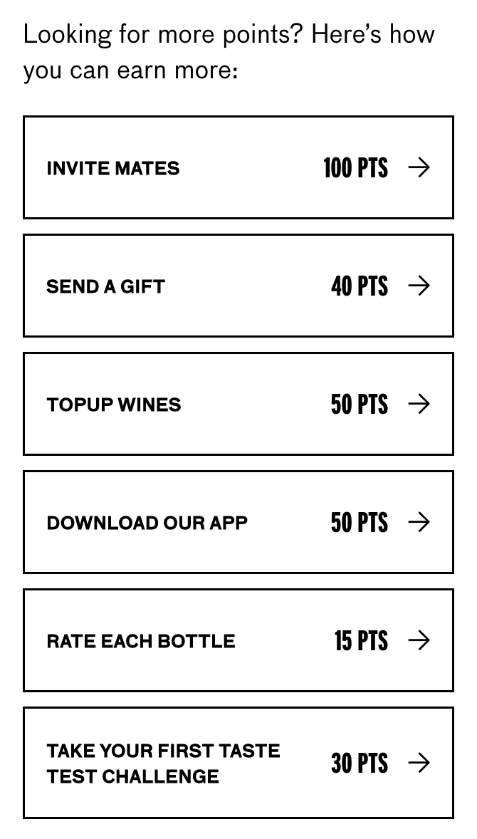
The most points are given for referrals. (But you and your mate also get a free bottle of wine sent with your box.) And as you hit milestones with your points, you get rewards. These range from magnets to bottle stoppers and cheeseboards.
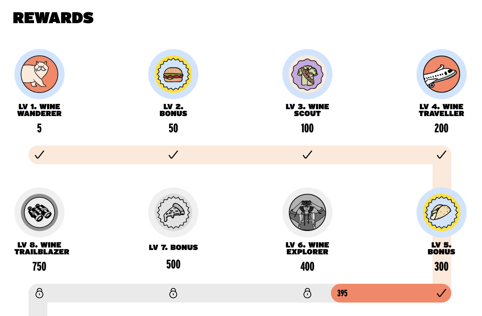
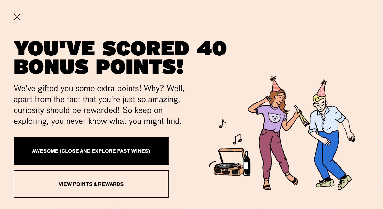
Not many companies do this anymore, so it’s another way they stand out. They’ll also give you bonus points occasionally just for engaging. It’s such a simple way to incentivize people to continue. I interact with their site so much because of it.
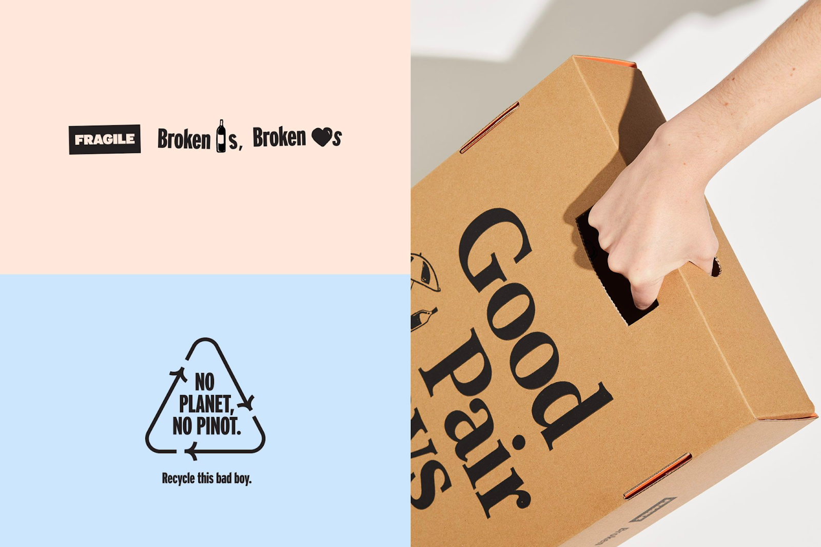
They also took the rebrand opportunity to go greener. And the design studio managed to create 100% recyclable packaging. Which fits into the company’s “No planet, no pinot” sustainability fund to help winemakers affected by climate change.
Good Pair Days understands the customer experience isn’t just about web design. People care about what they receive. And what they have to throw away.
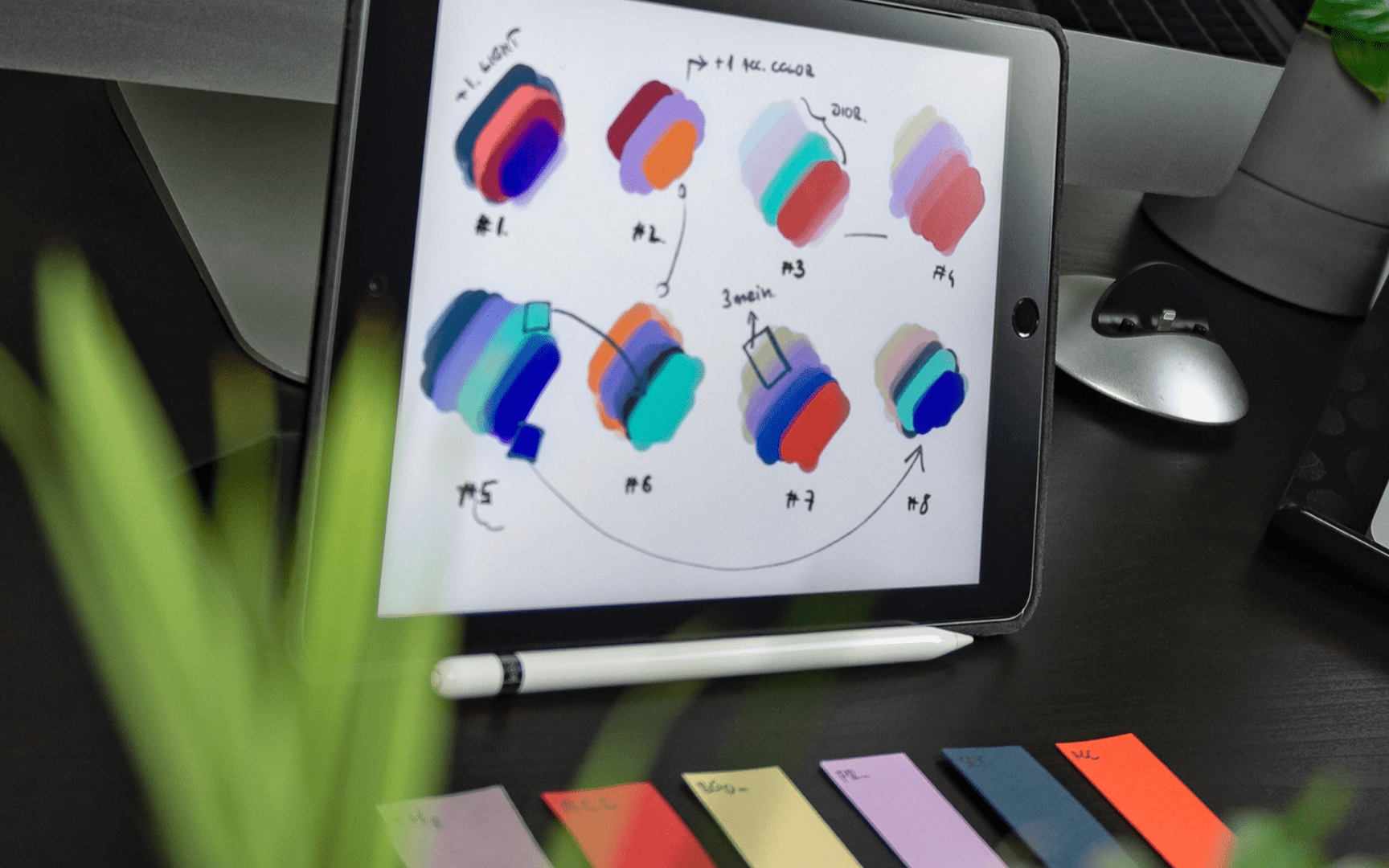
Having a brand identity with a human touch is so important. But even more so when you’re a purely digital company. And everything about Good Pair Days is so unique. From the color palette to the graphic design, typography, and illustrations.
This brand has thought about every stage of the customer journey. Not just a new cool name from a copywriter. And it’s all tied together perfectly. Show me a rebranding case study more effective than Good Pair Days. I think you’d be hard-pressed to find one.
If you’re interested, check out the full design case study from the branding agency’s site.
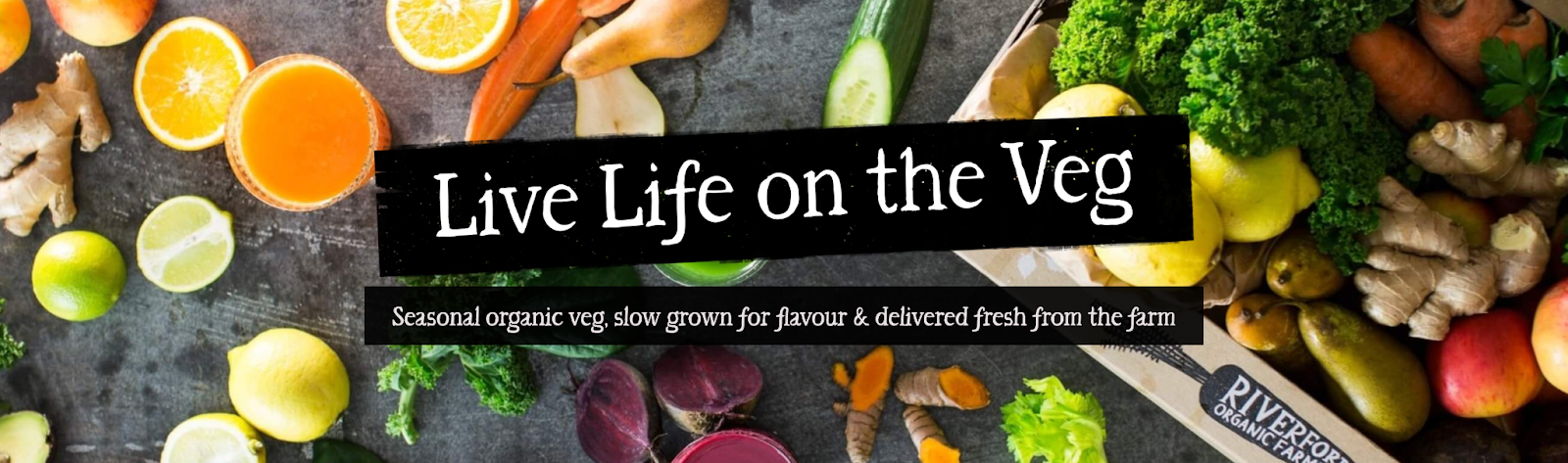
Riverford Organic Farmers – honest marketing and a simple customer journey
Healthy eating shouldn’t be hard. But it’s a lot easier to buy a burger from a fast food place than it is to prepare a home-cooked meal. Riverford are trying to change that. By offering weekly home delivery of produce from organic farmers.
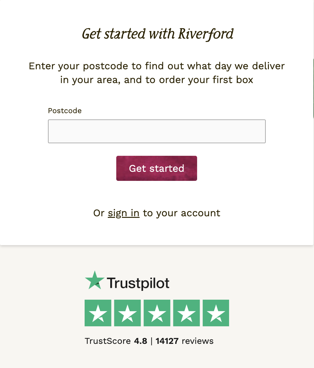
Riverford is all about eating seasonally and sustainably. For maximum freshness and flavor. And the customer journey for this branding case study couldn’t be simpler.
The only thing they ask for to get started is your postcode. Because this will immediately tell you if your area is covered. Plus, there’s a bit of social proof underneath to give you instant confidence in them.
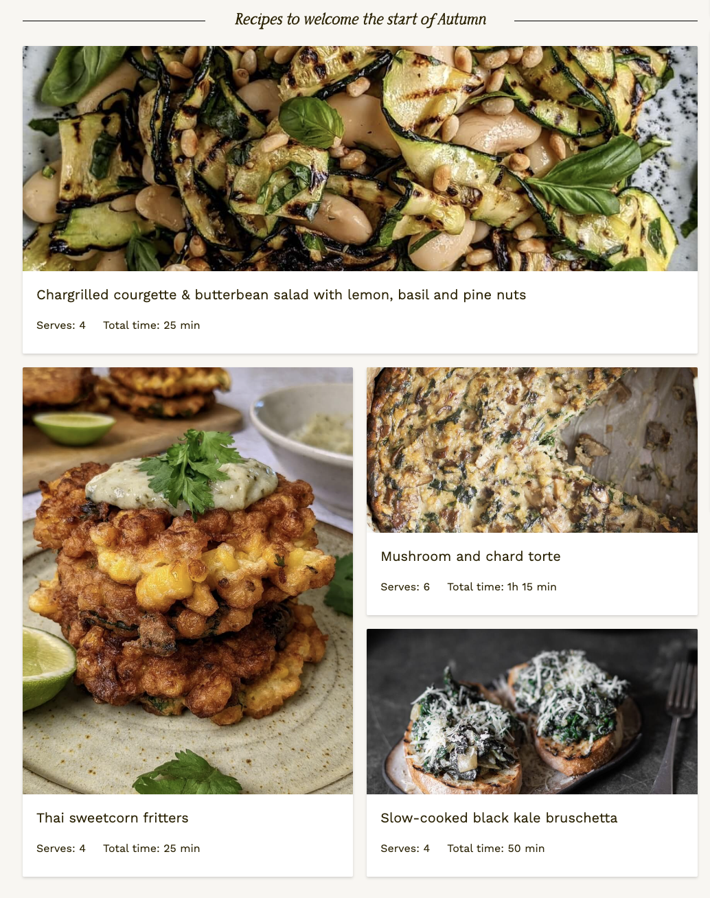
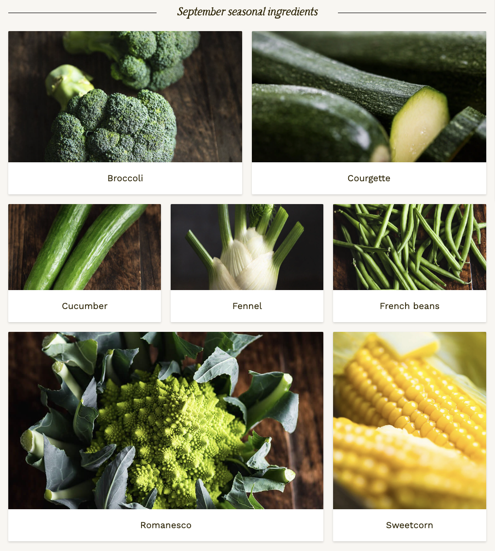
Once that’s confirmed, you’re ready to browse their product. If not, you can still check out the rest of the site. Riverford focuses heavily on education around seasonal farming. They’re trying to move us away from the modern mindset of thinking all fruit and veg should always be available.
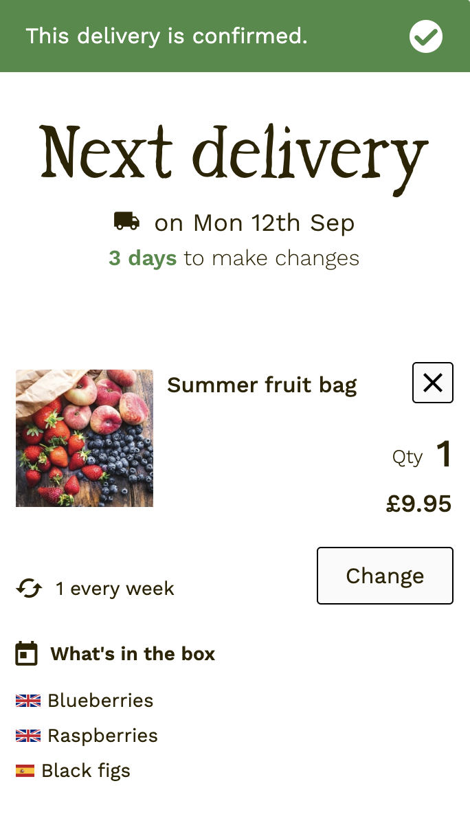
The whole process is clear and easy to use. Adding and removing food happens at the click of a button. And it’s clear what’s in your next delivery and when it’s coming. You can also easily pause deliveries if you’re going to be on vacation. Or just haven’t used up your last box yet:
They don’t try to make it difficult, either. Because education about reducing food waste is a huge part of their content. They focus on what’s currently in season and how to use it. And you can still use this knowledge even if you’re not in their delivery zone.
Like most brands, a lot of their marketing strategy takes place on social media. They post tons of great videos on their site and Instagram. Recipe and cooking videos are huge on visual platforms like YouTube and Instagram/TikTok. And Riverford jumped onboard at the right time:
They’re also really active on Twitter. Replying to customer queries and sharing stories. And just generally being friendly and informative:
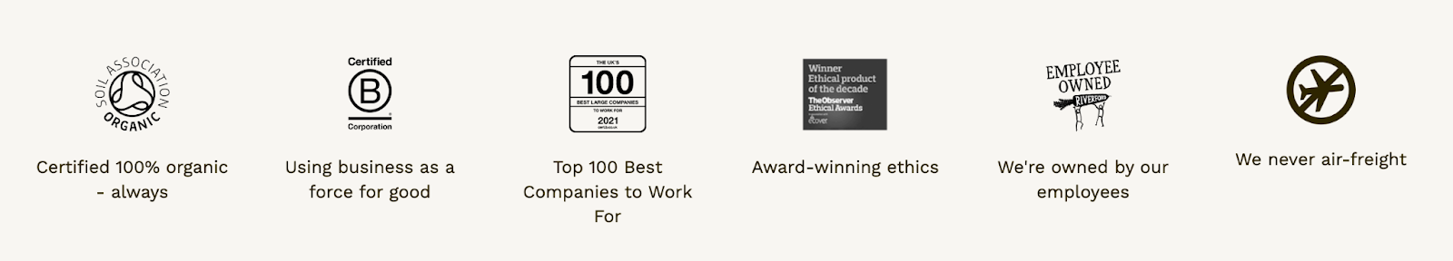
They do a lot for the environment too. But they don’t shout about how great they are on their landing pages. They hit their important values with small icons that potential customers align with:
But the information is there on the site if you want to find out more. And it’s all really impressive. It makes you feel like you’re doing good by buying from them. And that’s what most customers want.
It’s also clear they listen to feedback and take it on board. Less plastic and compostable packing were a couple of the biggest wishes from customers. And in 2021, they made it happen:
The farm’s founder (seen in the video above) also sends a monthly update with opinions and updates on what’s going well and not so well. It all plays into a really honest brand image which makes them feel trustworthy. And that’s a huge hurdle that not many brands get over.
Riverford also have a magazine and podcast called Wicked Leeks. Centered around sustainable food and ethical business. It’s a marketing case study that shows the power of branching out into other types of content. Even in traditional industries.
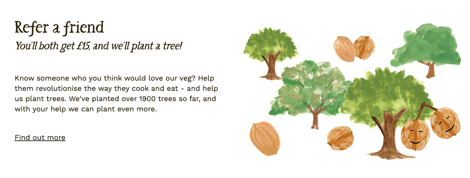
Finally, their referral scheme. Helping more people eat healthier for less and planting trees while they’re at it. I recommend Riverford to people I know without it. But it’s just another reason to love the company and service.
Farming is probably as far removed from the online world as you can get. But Riverford nail their digital marketing. They succeed in showing how easy it is to change our eating habits. With a clear customer journey that educates while it sends locally-grown, organic food to your doorstep.
Itch – two personalized services for the price of one
All of us with pets know we should be treating them for pests like fleas, worms, and lice. But remembering to prevent it is probably not high on your list of priorities. Itch was created so you don’t have to.
This branding case study is a monthly treatment that’s posted out to you. The dose you need is already measured out. And they’ll send it on a vet-approved cycle. Like Riverford, they’ve also added social proof to their landing page to show the number of people that already trust them.
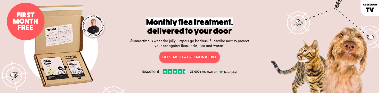
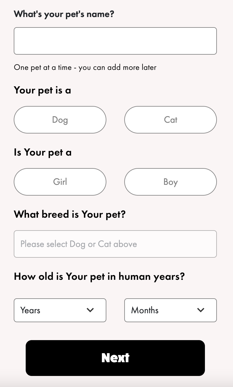
They also have an introductory offer that sends your first box free. So, there’s nothing to lose by trying them out. You just need to answer a few things to get started. Because this will determine the dose you’re sent. And how often.
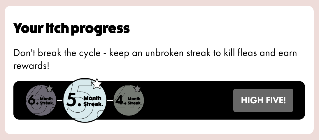
Once you start getting deliveries, they keep it fun by monitoring your winning streak. This is a really simple type of gamification that doesn’t need much development at all. But you may wonder why you should bother?
Well, streaks are a marketing psychology tactic used by lots of businesses. Because they can be addictive:
“They create an emotional response and an implicit system of reward and punishment. The longer they go on, the greater the perceived gain of maintaining them and the greater the perceived loss of breaking them.”
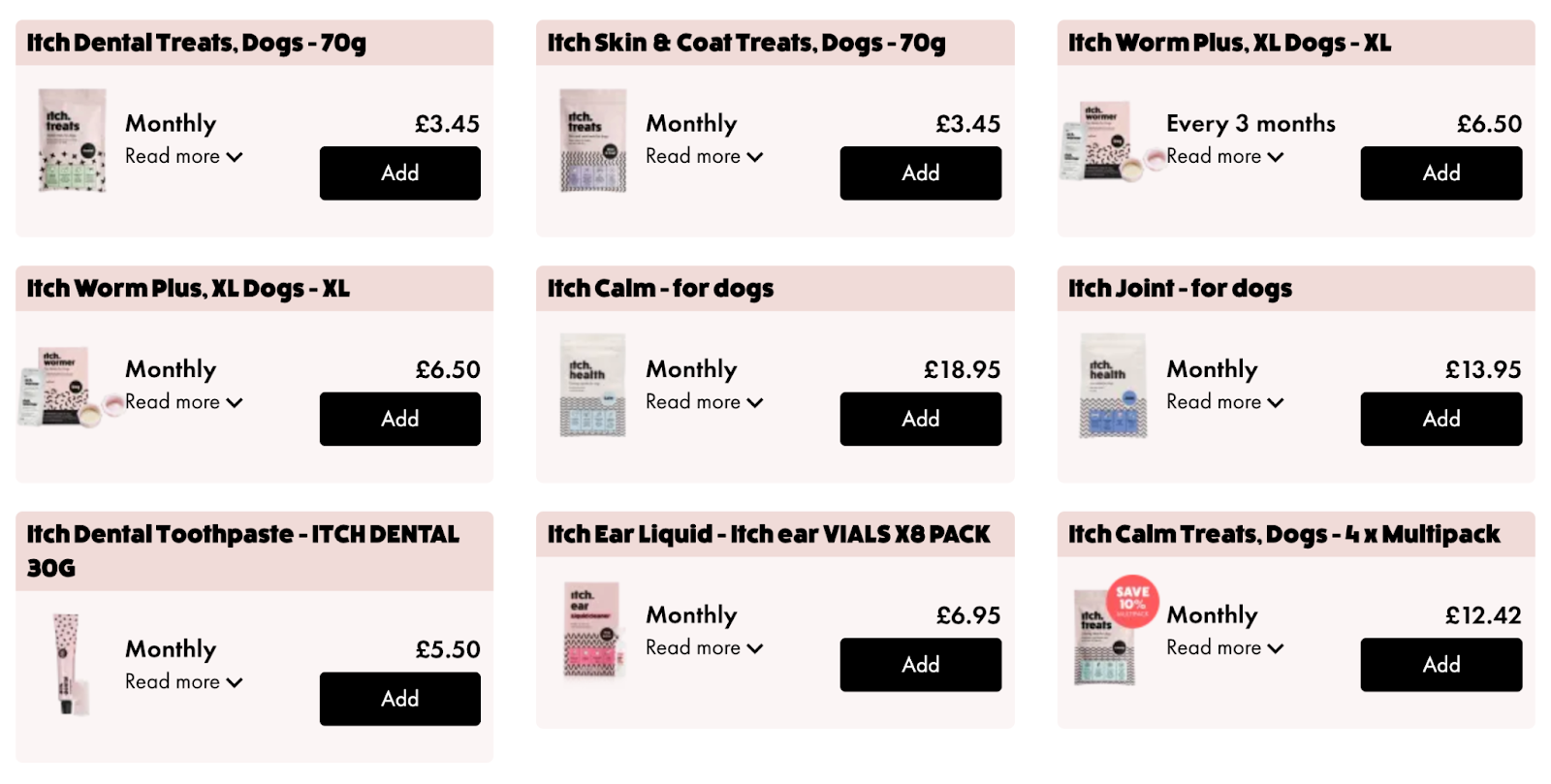
Flea treatments are Itch’s main offer. But they also sell treats, supplements, and other health products like toothpaste. And they make it easy to add any to your monthly box on a recurring basis with one click.
They also have a simple referral scheme for 20% off for you and a friend. It’s not crazy imaginative. But it’s always a nice touch.

Pest control and medical care are two things you can’t go without when you have a cat or dog. And one of the biggest benefits of signing up to Itch is the free access to FirstVet. A 24/7 subscription for video calls with UK-registered vets.
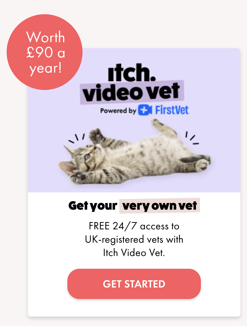
I’ve signed up to both services, so I’m speaking from experience here. I used FirstVet for a free consultation to confirm my dog had kennel cough. And it saved me spending $60 on nothing at my local vets. It’s such a clever concept and the UI (user interface) is simple and smooth.
Getting two important services for the price of one is amazing in the current climate. If you can partner with another site or app in your niche, you can create an offer that beats all your competition.
Conclusion
The brand experience you offer can leave a lasting impression on your audience. It can make them want to come back for more. Or you can be an easily forgotten one-time purchase.
It doesn’t matter who your consumer is. Whether you’re a D2C or B2B brand. Your overarching goal is to make downloading or buying easy and enjoyable.
These 3 branding case studies all rely on their online service. And each has created a seamless, unique journey. Everyone in your niche is vying for the same people’s attention. So, make the choice to go with your business an easy one.
Are there any other branding case studies you’ve learned from? Which big brands could do with putting more thought into theirs? Let us know in the comments below.


Thank you very much for sharing, I learned a lot from your article. Very cool. Thanks. nimabi